Dashboard
Table of contents
Overview
The Dashboard is the landing page that opens automatically after a successful login. It provides a high-level overview of the database and the upcoming Earth Observation activity.
Access requires the AccessOtherDataButProgrammatics permission.
Layout
The Dashboard is split into two horizontal sections:
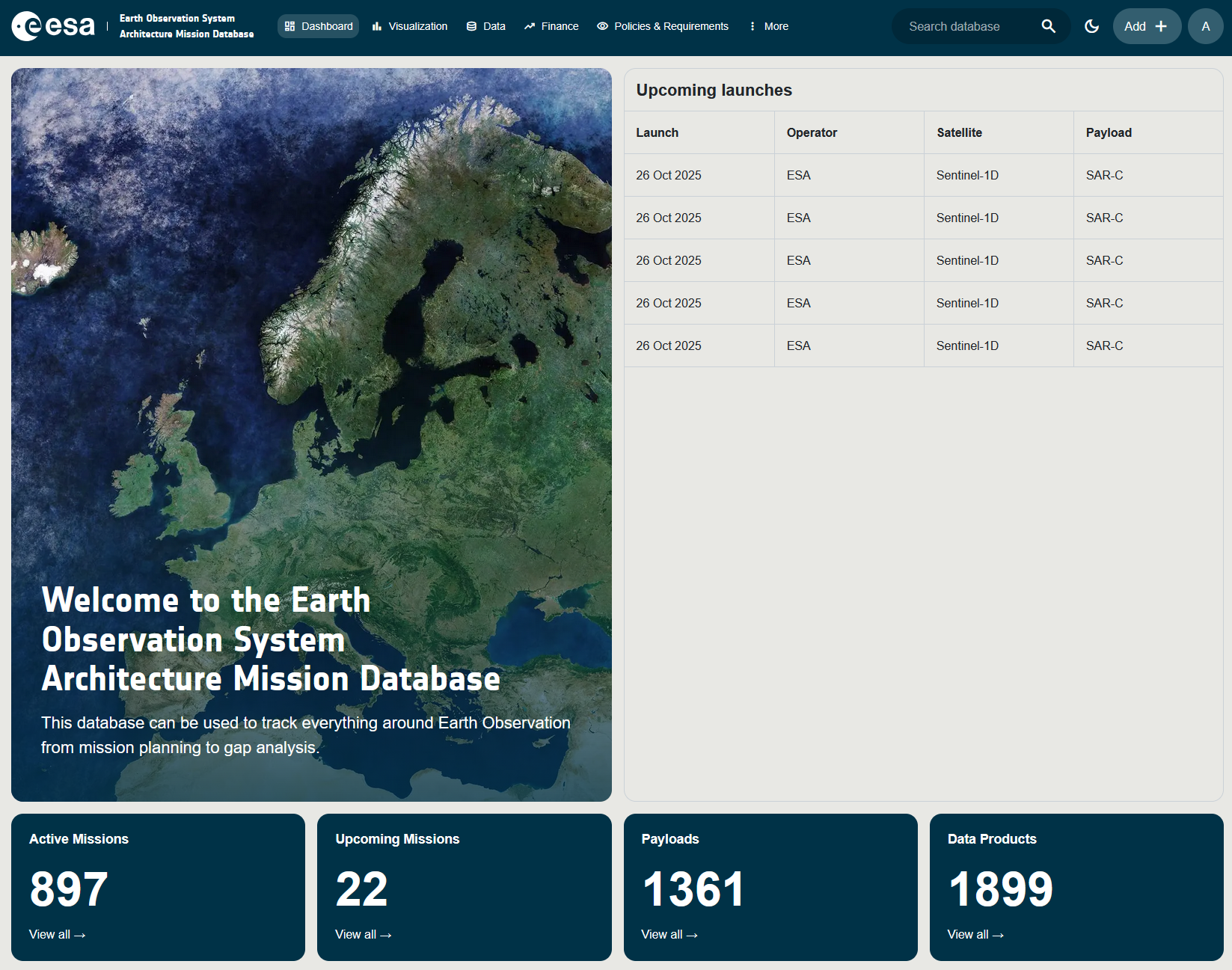
1. Header Banner
The left side of the header shows a rotating carousel of five full-bleed satellite/mission images with a dark overlay. Displayed on top of the imagery:
- Heading: Welcome to the Earth Observation System Architecture Mission Database
- Sub-text: “This database can be used to track everything around Earth Observation from mission planning to gap analysis.”
2. Upcoming Launches
A compact table on the right of the header lists the next planned launches. Each row shows:
| Column | Description |
|---|---|
| Launch | Planned launch date. |
| Operator | Agency responsible for the launch. |
| Satellite | The satellite (System) being launched. |
| Payload | The primary instrument carried. |
3. Info Cards
Below the header a row of Info Cards summarises the database content. Each card shows the total count for one entity type and is a clickable shortcut to the corresponding view (typically the Data or Timelines page filtered to that subject). Cards include, for example:
- Number of Missions
- Number of Instruments
- Number of Data Products
- Number of ECVs / Requirements
- Number of Space Programmes
The exact set of cards displayed depends on the user’s permissions.
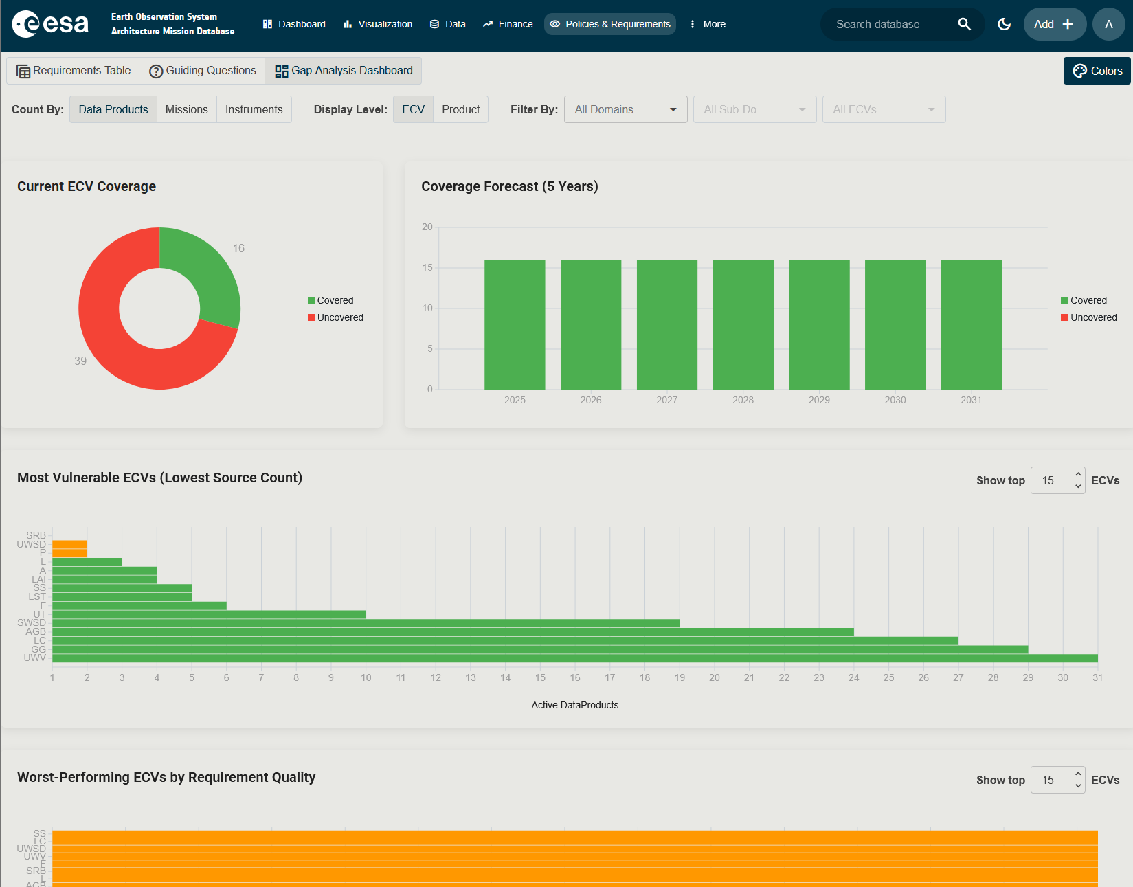
4. ECV Coverage Charts
Below the info cards the Dashboard shows a set of charts that summarise how well the database covers Essential Climate Variables (ECVs). What is an ECV? An ECV is a physical, chemical or biological variable used to monitor Earth’s climate (for example Sea Surface Temperature or Soil Moisture).
A toolbar at the top of this section lets you reshape the charts:
| Control | Description |
|---|---|
| Count By | Choose what is counted as a source of coverage: Data Products, Missions or Instruments. |
| Display Level | Switch between ECV (one row per ECV) and Product (one row per ECV product). |
| Filter By | Three cascading dropdowns to narrow the charts to a single Domain, Sub-Domain and ECV. |
The charts shown are:
- Current ECV Coverage: a donut chart that splits ECVs into Covered and Uncovered. Hover any slice to see the list of ECVs in that group.
- Coverage Forecast (5 Years): a stacked column chart that projects covered versus uncovered ECVs for the next five years, based on planned missions.
- Most Vulnerable ECVs: a horizontal bar chart that lists the ECVs with the lowest source count. Use the Show top N ECVs numeric input to control how many bars are displayed.
- ECV Quality: a bar chart that compares the quality of measurements per ECV across processing contexts.
To customise the colours used by these charts, click the Colors button (where available) to open the Dashboard Colors dialog. Pick the colours for Covered and Uncovered and click Save. Your choices are remembered for future sessions.
Navigation
From the Dashboard you can reach every other application area via the top navigation bar (see Home). The user menu (click your initials in the top-right) gives access to the Claims & Permissions page, the About dialog, and the Logout action.